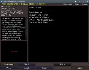
r41.6 is now out in both demo and subscriber builds. Read on for information on the changes and future plans:
Desktop/Mobile Install
You can now install the game to your PC or mobile device. Then you can launch it from your start menu or home screen:
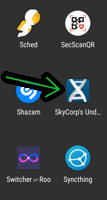
As this is built as a PWA (a kind of lightweight web app), no special permissions or manual updating should be required. Under the hood, it’s still just the website… but easier to get to now.
Portrait Mode
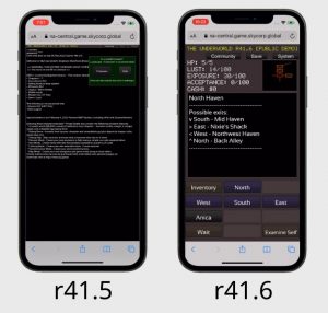
In addition to the existing landscape orientation, you can now play the game in portrait mode. This is especially helpful for new mobile players who may be confused by having to rotate their phone to get the UI to resize correctly. Here’s a before/after for comparison:
In addition, the game does a better job of resizing to fit the available space. So there should be less instances of buttons clipping offscreen on mobile devices when the browser URL bar pops in and out.
Colorized Buttons
As you may have noticed from the above screenshots, some buttons are now colorized to help differentiate them (ie: navigation). This can be disabled in settings if you prefer the old style.
Misc Improvements
- System dropdown created — allows for quick entry into fullscreen mode, and links to other system tools (install, etc)
- Quit button (finally!). Great for when you want to select a different build or load a game (no more retyping the website URL)
- When session ends, there are now links back to the build select screen
- Website – the What Is page includes some zoomable screenshots, along with big buttons on a few key pages
- The beginnings of some secret stuff that’ll be useful for the next content update :3
Bug Fixes
Fixes for the following issues:
- Janky text box scrolling behavior on mobile/touch devices
- 53: Succubunny w/ Elijah scene text typo
- 54: Arya typo
- 68: Height does not save
- 87: Interesting softlock with the pound
- 88: only showing top row of controls
- 72: UI buttons on bottom of screen are cut off on mobile
- Double-tap to zoom on mobile devices when trying to push buttons
- Randomly selecting button text when trying to click/tap
- In landscape mode, it’s possible for the height of the items scroller to be too high and go offscreen
- improvements to world items popup (many items) so that it A) doesn’t render offscreen in portrait mode, and B) renders above the button correctly and C) selects a height so that buttons will cut off if there’s too many of them, better hinting at there being more items to scroll down and look at
- On rotate, should refit all button texts, In landscape mode, map height isn’t resizing based on available space, Examine self button is not still there on ios
- More accurate text autofit for buttons
- disable hover states on mobile to prevent weird button coloration
- Only show subscribe button if not subscribed
- Fixed some logic so in demo mode logout doesn’t force a re-login
- made login/register forms push left/right as appropriate so it’s much easier to see on mobile (but still has side by side layout for desktop).
- Prevent header from clipping into community button on narrow widths
- discord link – fixed bug where blue names went away for six hours every month
Coming Up Next
It’s taking a while, but I’ve got some cool stuff coming for the next DLC content update.
A little reveal… it’s a return to the sewers area~ If you enjoyed becoming a titslug, get ready to spend way longer as one 😉
Ads
I’ve also been experimenting a bit with trying to advertise the game more. In addition to a new fancy landing page, I’ve also been making some GIFs. Here’s an ad you may have seen on a website or two:
And I have a new one coming, also:
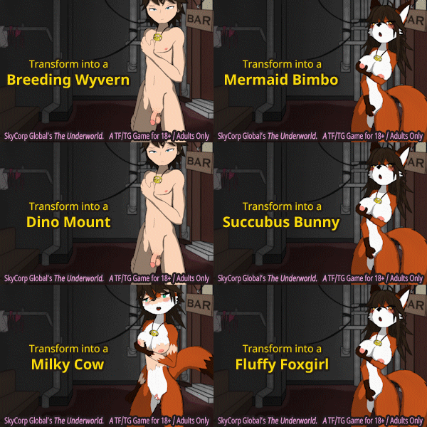
The fox gif features brand new artwork, which was created by Alewdamao. The GIF version can be downloaded at the top of the page, or here are the HQ stills: 1, 2, 3, 4.

